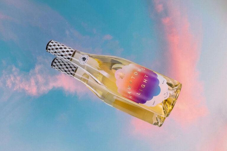
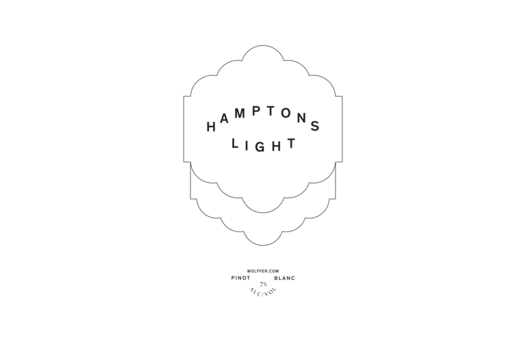
Hamptons Light
—Wölffer but Lighter
About the project
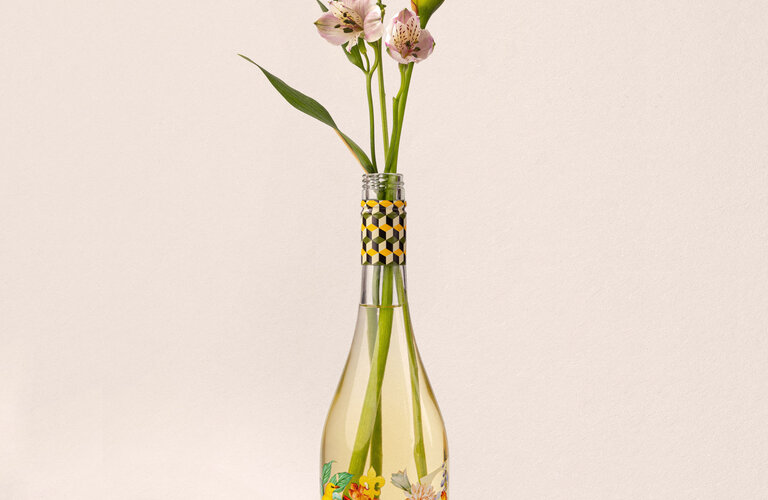
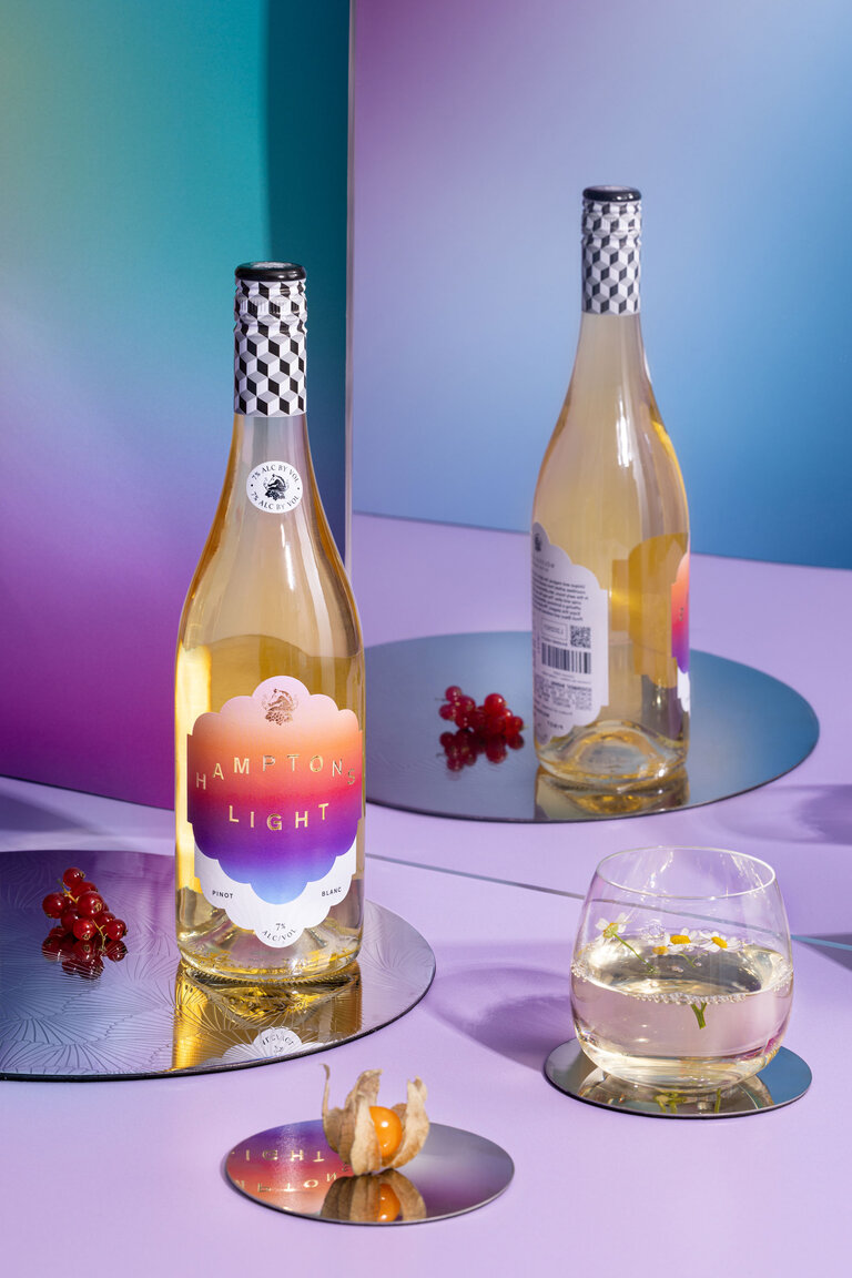
Wölffer Estate continue to explore the growing low and no alc. categories as shifts towards wellness and moderation continue to grow. Hampton’s Light is a 7% Sophisticated Pinot Blanc, refined, balanced and flavorful.
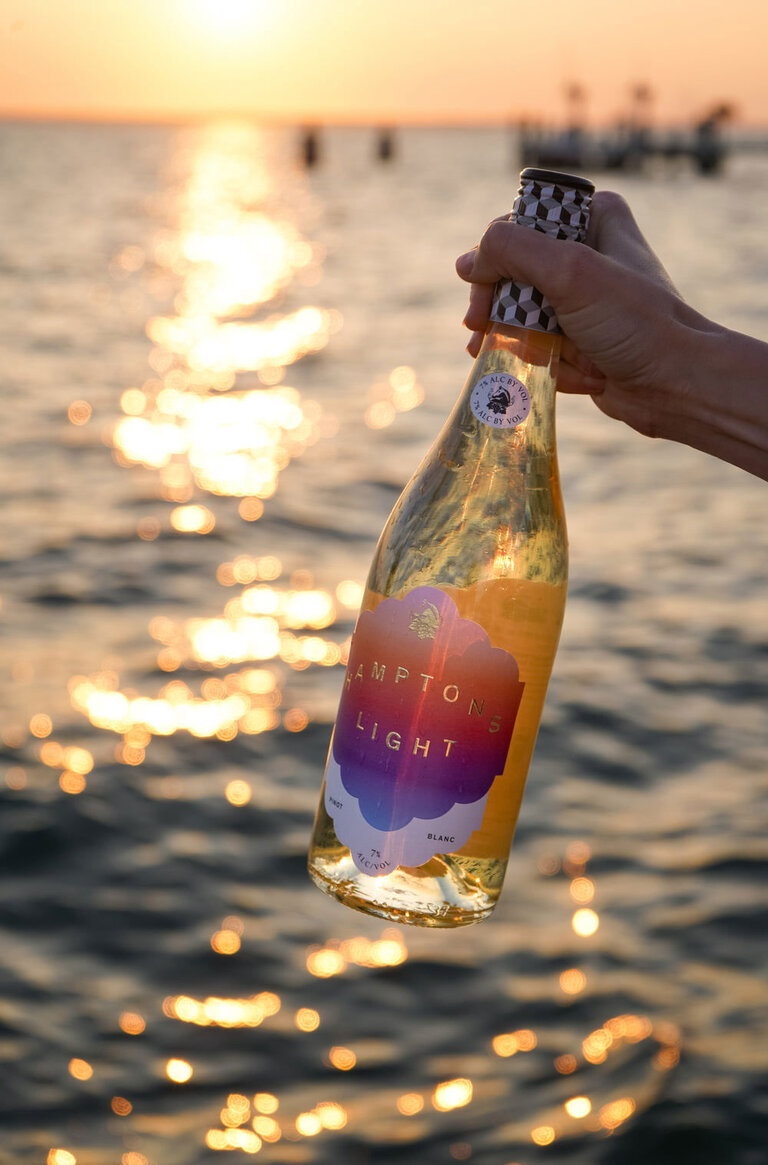
The wine, and name, are inspired by the famously wondrous light in the Hamptons, a light that has captivated people for as long as it has bounced of the waters of the Atlantic, the way it bends between land and sea, softening the edges of all it touches. The Atlantic horizon reflects a clarity and shimmer that meets the warm, sandy dunes, creating a luminous, almost ethereal glow. Morning and evening are particularly striking, as the sun lingers low, painting cottages, marshes, and shorelines in shades that feel at once golden and surreal, as if the world is briefly suspended in a dream.
This light has a way of transforming ordinary moments into something almost sacred. It catches in the waves, glances off weathered shingles, and lingers in the spaces between trees, making colours richer and shadows more tender. There’s a sense of calm, of time stretching and breathing, that makes the Hamptons feel alive yet gentle—an atmosphere where every glance and every step feels touched by quiet magic.
Artists, photographers, and romantics have flocked here for decades to capture moments of serene ethereal beauty.
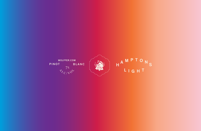
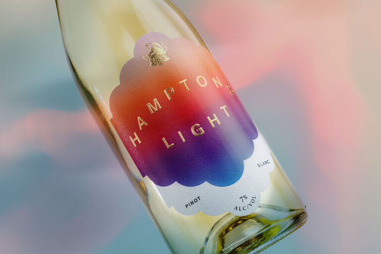
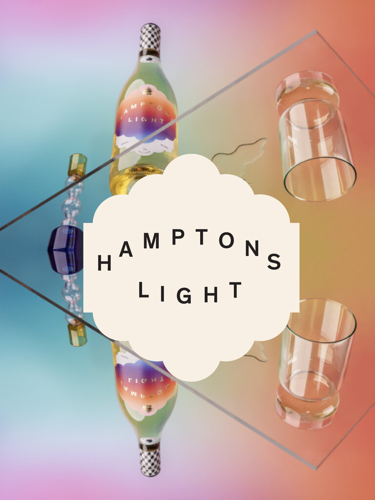
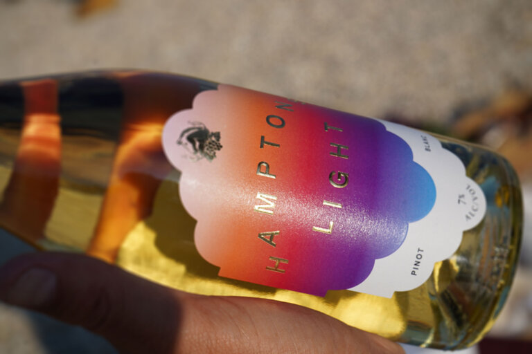
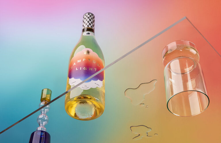
The label design uses a simple gradient, blurring the reflection of sea to sky and back. A pillow embossed logo in gold foil reflects the label colours back on themselves like light bouncing off of the ocean, twinkling in a warm summer glow.
Sectors
- Food & Beverage
Services
- Branding
- Art direction
- Packaging
- Naming
- Copywriting
What they say
I’ve worked with John Gilsenan and Iwant Design for over 12 years, and in that time his designs have been instrumental in building our brand as a whole. He consistently delivers forward-thinking, creative work with real wow factor, shaping everything from our labels to our menus and digital — including the now iconic Summer in a Bottle design — and giving each element a cohesive and distinctive look. John communicates clearly, engages with the production process to ensure the best outcome is always achieved, and approaches billing in a straightforward, professional manner. His creativity, reliability, and professionalism have made him an invaluable long-term partner for Wölffer.
Max Rohn – CEO Wölffer Estate